Ever since I played the video game 'Fallout 3', I have always been fascinated by Pre-War / Post-War advertising and how it becomes to be so effective. I feel that retro posters and packaging designs are keen to the eye, it is almost like stepping back in time and for those of the older generation, it could be reminisced in many ways. The design on the right is one of my favourite posters advertising the game, it doesn't give too much detail away, but it does show it in a post war apocalyptic land. Even the concept of 'apocalyptic' can be a long conversation in its self, which really engages me.
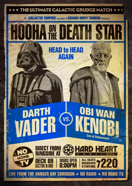
Linking in with the 'pre-war' scene, I find retro branding very eye catching and something that is only just starting to be used again in the graphic design scene. Professions such as; Coffee Shops, Barber Shops, Tailoring Shops, Brewery, and so forth, are great examples of businesses that are beginning to use this style of design. I have collated some of my favourite retro / vintage posters and logo's, which I personally find most appealing and engaging, I really like the typography / calligraphy used on some of the images below.


No comments:
Post a Comment