PART 2 of a 2 Part blog for Kingston University, expressing everything of design interest that I discover or want to share. From artists that inspire me to other blogs that I feel are engaging and events I have been to, this will be practically my design diary. Make sure you check out PART 1 of this blog, where it explains about who I am, some facts about me and so forth.

PART 1 HERE [ABOUT ME]

Thursday, 31 July 2014

Urban Movement #2.


Linking back to my previous post about 'urban movement' and how I feel it relates to art - I decided to look at Storror's Channel once again and I stumbled across this beautiful video titled; 'Chaps on Tour - USA'.

 I highly recommend you watch from '1:52'  to sort of get an understand on what I'm about to say as it links it with this section of footage. 


The overall combination of the music, video editing, footage and movements in the video compliment it entirely to make it one outstanding piece. They make sure that certain parts of the film is linked up with the song, making it all the more enjoyable to watch and also adding in Twixtor or 'Slow-Mo' in certain places to give it that 'WOW' factor. Along side the other video I linked in the previous post - this is definitely up there with my all time favourite Urban Movement videos. This video is much more 'arty' than the previous one, with all the effects and editing gone into it.

A very enjoyable watch by StorrorBlog once again.

Wednesday, 30 July 2014

Advertising - Pret A Manger.

I had always walked past 'Pret A Manger' but never in it until only very recently when I was desperate for something to eat and I fancied a change from the mainstream fast-food restaurants. Once I ordered what I wanted, I grabbed a seat and was pretty much fascinated by the playful advertising posters they had scattered around the shop.
 They played with the idea of showing their products and offers but instead of just displaying plain photograph of (in this case) a kettle - then manipulated ingredients that they use into making it look more appealing. For this idea - they manipulated an onion into being the base of the kettle then what looks to be a chilli or red pepper for the handle.
 Overall, I think these concept idea's are great way to advertise themselves not only for the products they sell but it also has the audience aware that they use organic and natural ingredients instead of processed 'stuff'.


I'm actually really glad I decided to have a change of scenery that day, purely because I stumbled across some great advertising which will stick with me for a good while now. My favourite Ad which I saw in there was probably the 'Peacock - Eat Colourful' advertisement. (Far Left)
 They used a mixture of fruit and natural surroundings to create this illusion of a peacock. The designer used what I can make out to be; A Pear, Kiwi fruit, Blueberries and Pine leaves'. Its a very colourful advertisement and is a great way to draw people in.


Search ResultsPret A Manger

Tuesday, 29 July 2014

Handful of Concepts - Anti-Phone Theft.


"Anti-theft mobile phone system.
"


This idea is for those who have the misfortune of their phone getting stolen - but I have a solution. With this pretty handy yet lethal idea, if your phone does get stolen you can safely know he/she was severely injured in the process. The Anti-theft system will recognise it has been taken from its owner and within 5 minutes (if not returned) - 2 knife blades will spring out either side of the sides phone. (Where the muggers hands will be). If by chance they don't have their hands on it - the phone will release a shock - almost like a tazer. Now there is a 5 minute delay on these effects; incase your friend or family are looking at a photo or a friend is borrowing it to call someone.

Handful of Concepts - Ping Pong Door.


"A door which folds out into a Ping-Pong table.
"


Taking the everyday designed door and giving it that more interactive twist.
 Making sure you and another person and enough room to play - the door can fold out from being vertical into a horizontal form almost like a 45ยบ motion becoming a fully functioning ping pong table. The net, balls and bats will be stuck onto the back of the door ready to use in a quick and easy fashion - Then once your done playing - just strap the equipment back onto the table and flip it back to its original state.

Monday, 28 July 2014

Personal Inspirations - Timothy J Reynolds.


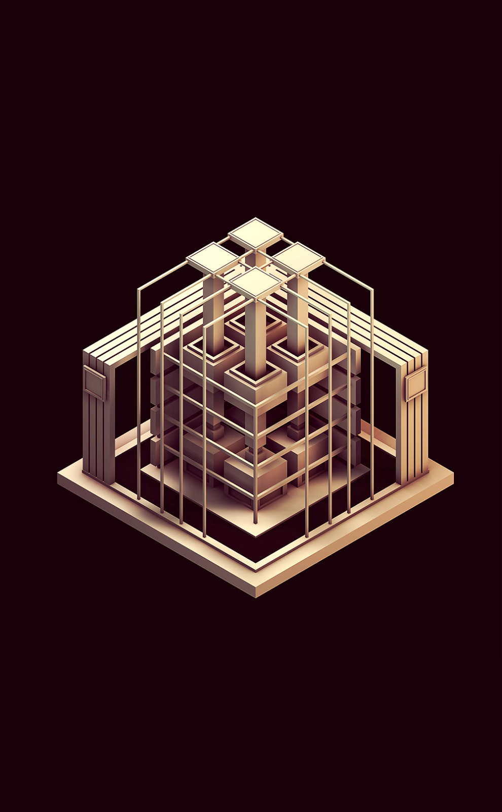
One of my favourite 3D artists and huge inspiration has to be 'Timothy J Reynolds'. It was after seeing his work which inspired me and drove me to try and start doing low poly styled modelling. His work is very clean and slick even if it has been heavily modelled, somehow he makes it appealing to his audience. The lighting used is just perfection, the shadows aren't too harsh - but they are just visible enough for you to see. 


He has worked with many clients & companies such as; Greenpeace, Facebook, Fast company, Wire and many more. If I'm honest I doubt I would've even considered low poly if he hadn't of started this style - so I really owe him a huge thank-you for introducing this style - not only to me but to hundreds and hundreds more.


I highly recommend you check out his portfolio / website - as he does have some incredible work on show, ranging from personal projects he has completed in his own time - to client projects. 


Sunday, 27 July 2014

Photographers I admire - J Bennett Fitts.


Linking in with my post about 'Matthew Merrettand his derelict photography - another favourite of this style is from a photographer called - J Bennet Fitts. Unlike Matthew's his work is more landscape based, specialised landscape based that is, he photographs abandoned and neglected swimming pools. I really like the compositions of each photograph, the atmosphere in each photo is very odd. It makes you feel like it has just been abandoned suddenly and overtime its degraded - personally gives me a weird eerie feeling.


These 5 photo's that I have picked out are probably my favourite photographs he has taken in this style. Everything is so remote and eerily creepy that it just makes the photo so much more engaging and exciting, you could almost use your own imagination about how these places came to be so abandoned / neglected and who was here before this degradation occurred. If you get the chance, check out the rest of these photo's in this style done by J Bennett - The work he has on there is extremely impressive.


Saturday, 26 July 2014

Handful of Concepts - Umbrella Gun.


"Umbrella with a water-gun handle."


Why not add a 'Water-Gun' handle on the end of an umbrella to make those rainy days much more worth while. the middle bar that supports the brolly would be a tube heading down to the gun so if its raining when you use it - it is collected at the top of the umbrella then transfers down the tube into the gun. You can also use it as a shield to hide behind incoming water fire from others.

Handful of Concepts - Black Remote.


"A remote control that works on any TV."


Much like my 'Black Control' idea, this has the same concept but obviously in a much different way. If you have ever like myself - managed to lose the television remote, not once or twice but it seems to be about 5 times a week. Anyway, it would be great to just run down stairs, grab another remote as a substitution until you find your other one - it would also save you money when having to replace or exchange an old remote.

Friday, 25 July 2014

Visits & Events - Manchester Northern Quarter.


 On Monday 21st July, I headed up to manchester initially for my sisters Graduation which was on the following tuesday. However seeing as I had a good 6 hours spare, my sister decided to take me to the Northern Quarter in Manchester also known as the [Art Quarter].
 I didn't really know what to expect when we were making our way there, was it going to be full of art shops and designer shops? Well the answer to that is Yes, but along 70% of walls and metal shutters were beautiful pieces of street art. This was the first 'piece' I walked past, it is on the side of a tattoo parlour which really links in with the design its-self. Its bold, bright, and well.. Arty! Another pretty cool feature about this is that on the railings of the staircase it has different coloured pedal bikes, clearly there just for decoration, but it fits in quite well.


We then began to make our way to a small coffee shop which is called simply 'TeaCup'. Now if it was any other coffee shop I probably wouldn't have spoken about it - but the one we went in was Owned by the Music Artist 'Mr.Scruff'. It was a nice little feature to know about the place and inside there were illustrations hanging from the wall in his style. I think I had a milkshake called 'Purple Haze', which wasn't Milk, and Marijuana Buds funnily enough. In fact it was actually a mixture of Strawberry Ice-cream, Milk and Blueberries. Then one it came out it was in fact purple, hence the name.

Overall it was a great little coffee shop - with a lot to look at inside visually and also a rather wacky menu including; Rainbow Cake, Mana Ma Na Milkshake and Classic cocktails.


Once we had finished having a drink; we then began to make our way to the hotel but obviously passing by as many streets as possibly. I'd say that almost each street we went down there was some form of street art just waiting to be photographed and viewed. Here are just some photo's that I took which I personally felt looked most appealing and engaging.


This is personally my favourite piece that I saw that day whilst roaming around the back streets. It is a funky re-creation of Loony Tune's 'Wile E Coyote' holding is well known 'Help' sign. The colours are very vibrant and engaging, when I saw this in a little doorway down a back alley I couldn't help but glance twice to make sure I was seeing right! I think the lighting and the composition of the artwork is really effective to the human eye.

Thursday, 24 July 2014

Handful of Concepts - Black Controller.


"1 controller that works on every console."


Seeing as I'm fairly big on gaming, it becomes an annoyance having to change platforms if say I'm going around a friends house and we end up playing a game. It would be much easier and make much more sense if there was just ONE controller that worked across every platform of game engine.

Handful of Concepts - Insect Catcher.


"A cup that catches insects by pressing a button that seals off the rim."


Ever just been sat in your room, then a wasp, fly or moth appears in their with you almost instantly distracting you from what you were doing. You then search around for something to kill it with, or if your less inhumane, a cup to catch it. The problem I find with catching the insect in a cup is that then suddenly there is nothing around for me to seal off the rim like a piece of paper of a magazine.
 This "Insect-Catcher" would have a fully functioning exit/entrance at the click of a button - making it more efficient and easy for you to catch those pesky critters.

Wednesday, 23 July 2014

Visits & Events - Magma Bookshop.

Once finished looking around Banksy's gallery, myself and 'David' decided to head down Magma Bookshop which was an eventful journey to say the least. After about a 20/30 minute walk and tube journey we finally arrived at what we though was the bookshop. So we ventured inside and had a look around - only to see about 10 books, and a whole lot of creative & crafting ideas. A pretty neat feature about this shop was that the shelves and side cabinets were made of cardboard and not your everyday MDF wood.

It wasn't until I saw pillows and tea-towels in the back when I felt it we may be in the wrong place.
After asking the cashier if there was a bookshop called magma near here and I got the reply 'Yes, its just a few doors down', I couldn't help feeling a little bit foolish. Never the less, I now know that, the little crafting shop is there with some really unique and creative items.

Literally about 10 shop doors down we came upon the actual Magma Bookshop. I have to say it was not what I was expecting - A small 'Hole in the wall' filled with all these books purely for designers or people who are interested in art. I was more expecting a replica of Waterstones, with books from each category ranging from Science to Cooking ect, but I have to say I was pleasantly surprised with what was there instead. 
 In total, I would say I spent about 30 minutes in there or more, if I'm brutally honest the time seemed to fly by, It is defiantly a shop I would go back to time and time again. There were books on typography, how to build your portfolio, and my personal favourite, a '1000 Dot to Dot book on iconic landmarks and famous faces'. 


One of my favourite books which in the end I actually brought is called; 


'Visual Aid - Stuff you've forgotten things you thought you never knew, and lessons you didn't quite get around to learning'

The book is basically about a variety of tricks and useful things to know - sort of like a scouts guide in a way but each page is visualised, there are very few words and many images. I guess what made me drawn to it was that there is no set guideline for the book, there is no beginning, no middle and no end. It can start with any fact and if wanted, it could be never ending. And at a price of £7.95 I can't go wrong.


This is just an example of what is in the book and to show how diverse each page is to the next, On the left there is 8 different cocktails and how to make them - perfect for student life. Then on the right we have how to do the 'Foxtrot' ballroom dance both Male & Female steps and next to it is a variety of Animal footprints - perfect if you are a hunter and intrigued by mother nature. 


Finally, another book which I found weirdly engaging was this book called; 

'Sneakers: The complete limited
editions guide.'

Now, as I said in my '15 FACTS ABOUT ME', I have a huge interest in trainers and this book just stuck out like a sore thumb to me; just waiting to be picked up. 
 The book consists of hundreds and hundreds of limited edition trainers / sneakers ranging from every brand you could think of. I'm not sure why this appeals to as much as it does - but if it was slightly cheaper I would've brought it without hesitation.

Tuesday, 22 July 2014

Handful of Concepts - Computer Coffee.


"A computer which serves you coffee and biscuits"


As clichรฉ as this idea is because everyone has thought of it, I still feel it would be a good great idea. The computer will know when your feeling grouchy or tired, and just like a coffee machine, a cup will drop from behind the computer - filling your cup to the rim with warm, rich coffee. Then as a compliment to go with the beverage - it will serve up 2 of your most favourite tasting biscuits.

Monday, 21 July 2014

Personal Inspirations - Iain Macarthur.


One of my main inspirations overall is an illustrator called Iain Mcarthur. For a while now I have been following his work and the unique style of illustration he produces, it has that different twist on most things I have seen. He is an english based artist and graduated from Swindon College with a HND in Illustration, he hopes in the future he would possibly go onto to do a BA in Illustration.


His projects can be described as
surreal and extremely diverse in its own way. He uses majority of pencil, watercolours and pigment pens in his work and with these materials, he creates portraits of ordinary people and animals. He creates them in a unusual way by using exaggerated patterns and watercolour effects into the portraits to give a vivid explosion. Almost transforming their faces from something ordinary to something entirely bizarre and jaw-dropping...


I think another reason why I like his work so much is that I would LOVE to draw like this one day being so free and surreal in my work. However, its something that would take a lot of time and practice... and patience. I highly recommend you checking out his website / portfolio where the majority of his work is as its such a wonderful page. Definitely will be keeping an eye on his work and using him for inspiration in the future.


Sunday, 20 July 2014

Handful of Concepts - Invisible Earphones.


"Invisible in-ear headphones
"


For a while now, I've always had this strange invention of in-ear headphones which are invisible, meaning nobody can tell if your listening to music or not. Quite useful if you want to ignore someone you don't like, they won't know if you are listening to music or you're just being ignorant. 

Handful of Concepts - "Weetabrick".


"Making a wendy house out of weetabix."


This idea came initially from a dream I had a few months back where I used Weetabix to build a wendy house instead of using concrete bricks. Its almost like substituting the main resources we use in our day to day lives and instead using something we have to maintain our hunger levels with. After thinking over this concept I could call the new brand "Weetabricks", quite obviously it being a pun on the word Weetabix and also because the weetabix's look kind of like bricks.

Saturday, 19 July 2014

Visits & Events - Banksy's Gallery.


On Wednesday 16th July, myself and a fellow graphic design student 'David' headed down to London, to look at a few galleries ect. One main attraction which stood out to me before this day was Banksy's gallery located at Sotherby's in Oxford Street, the exhibition was called;


"The Unauthorised Retrospective".


For a few years now, I have loved his work and the way he portraits it; whether that is where he displays it, or the variety in it all - it fascinates me. Going to his gallery was a real eye opener as I have now learned a lot more about him that I previously knew. 


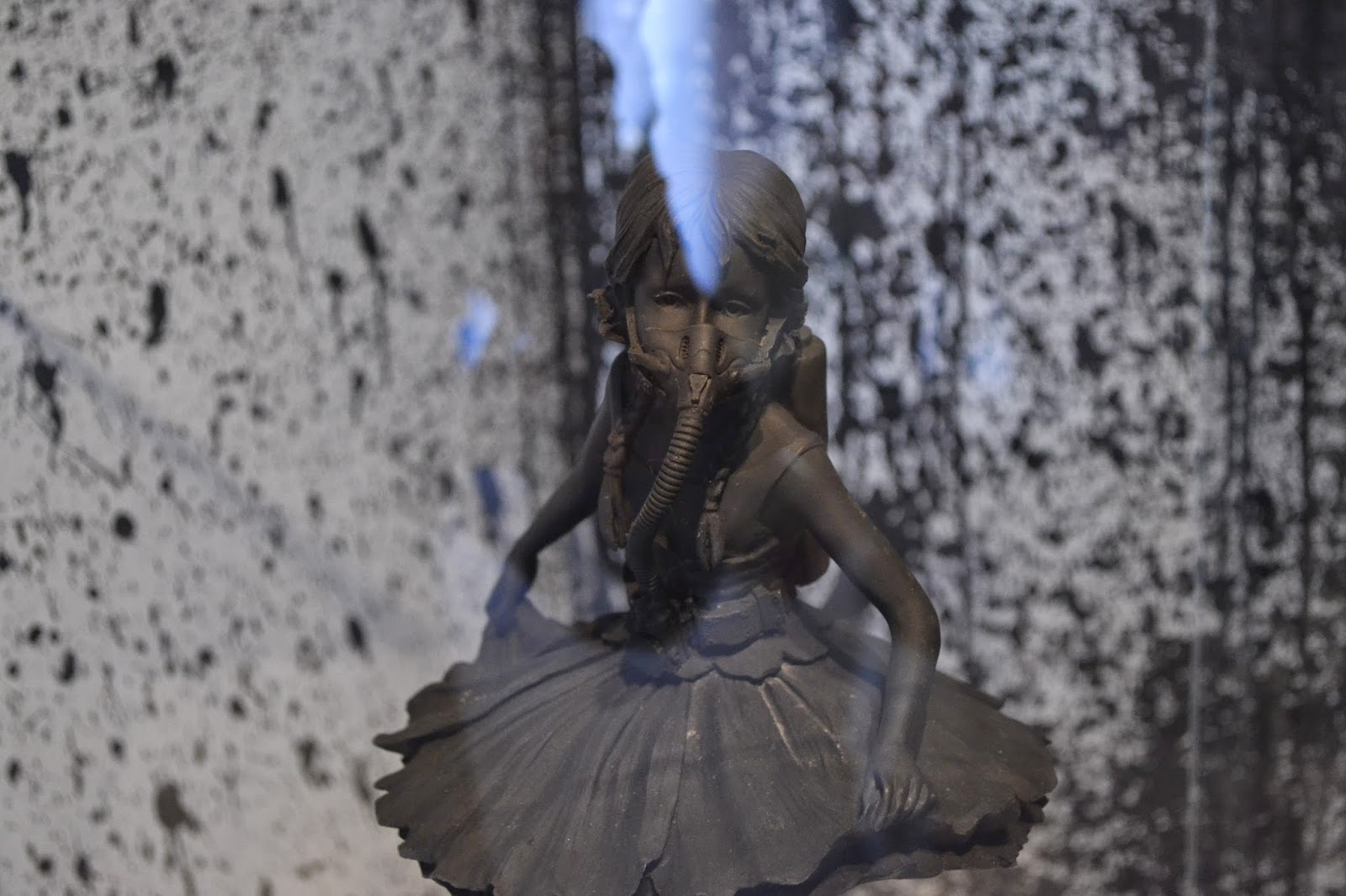
Before heading to his gallery, I had no idea that Banksy was involved in 3D modelling. As shown above - he had 2/3 bronze cast models that were all in his unique style however this one is really quite powerful. It shows a ballerina looking as if she has just finished off doing a pirouette, but she is standing on a dump site with a toxic barrel beside her feet. Then there is what looks to be a breathing apparatus around her mouth, almost showing a pre-war girl which was a dancer, using any means necessary to continue doing what she loves.
Unfortunately, I didn't take a full length photograph but if you CLICK HERE you will be able to see the full image. 


One of my personal favourite pieces of work that I saw in his gallery was this piece titled 'Trolley Hunters'. Essentially what I worked out from this is that there are these group of uncivilised people going out to hunt for food, but instead they come across these shopping trolleys. Clearly they have never seen anything like this before so they assume it is another type of animal or something so they begin to hunt.


All in all, really happy I went to this exhibition and experienced his work for myself in person instead of just sitting at a computer and gathering research. If he ever has another gallery show on in London, I will be sure to try and go.

Thursday, 17 July 2014

Handful of Concepts - Robinsons Alcohol.


"Create an alcoholic drink range for Robinsons Squash
"


Robinsons Squash are renowned for their fruit juice's such as orange, apple, summer fruits ect. and they are available for all ages. So I thought why not create a sub-brand beneath Robinsons which is purely just for adults and not just any ordinary drink. Alcoholic drinks.
 There could be pre-made cocktails, straight spirits, ales - you name it, if it has alcohol in, then It would be applicable. Still keeping it in the distinguished Robinsons Squash bottle so it is recognisable to the market, but obviously it would have to be shelved down the alcoholic section.

Design Blogs - Spoon Graphics & Size.


Wednesday, 16 July 2014

Urban Movement - #1.


For a while now, I've always seen parkour, free-running or any other form of urban movement another pathway of art. From an early age, I was one of those kids constantly climbing tree's or the wooden frame in the local park giving my mum a heart attack each time I leapt from branch to branch.

  Then by the time I was about 13, I had discovered the urban sport of Parkour, which I loved. The idea of getting from point A to B in the most quickest and efficient way as possible seemed like an ongoing challenge wherever I walked. From walls to roofs and making the everyday walker stop and stare at what you were doing gave myself huge thrills.


However, by the time my GCSE's had finished I felt like I had other priorities to take on board, slowly but shortly my time spent out in the concrete jungle grew shorter and shorter until I no longer 'trained' anymore. Even now I find
parkour and free-running a huge influence and given half the chance I would get right back out there. Whats stopping me? I have that mental wall each time I'm faced with a new challenge and it takes me longer than it should do to overcome face my "fears" if you will.


To this date, I still see the urban sports as a different take on art. Instead of paint on paper, or layers in photoshop the tool of choice is the human body, and the canvas is right beyond your doorstep. The amount of limits the human body can be pushed through just by on going urban movement's is almost out of this world. I find it almost as if in the mind of a free-runner, that the buildings and structures out there are just waiting to be used in a new project.

This is just one of my favourite Urban Movement video's, by a group called 'Storror Blog'.  Not only do the movements make your jaw drop, but along with the video camera work and the sense of danger throughout it, it makes it all that more engaging and artistic.